What is the best colour to match your personality?
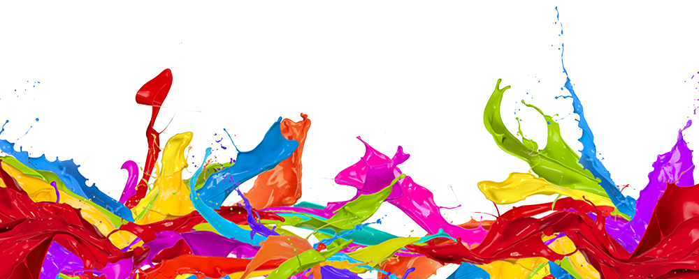
Colours can change your mood, help you recover from disease, make you look thinner. But we have to use colours carefully. Too much bright colours can make you feel tired or angry.
Black is associated with power, elegance, formality, death, evil, and mystery. Black is a mysterious colour associated with fear and the unknown (black holes). In colour psychology this colour gives protection from external emotional stress. Some of us use it to hide our weight; others among us use it to hide our feelings, our fears or our insecurities.
A black suit or dress can make you look thinner. When designing for a gallery of art or photography, you can use a black or grey background to make the other colours stand out. Black contrasts well with bright colours. Combined with red or orange – other very powerful colours – black gives a very aggressive colour scheme.
White is associated with light, goodness, innocence, purity. White means safety, purity, and cleanliness. As opposed to black, white usually has a positive connotation. White can represent a successful beginning.
In advertising, white is associated with coolness and cleanliness because it’s the colour of snow. White is associated with hospitals, doctors, and sterility, so you can use white to suggest safety when promoting medical products. White is often associated with low weight, low-fat food, and dairy products.
Purple combines the stability of blue and the energy of red. Purple is associated with royalty. It symbolizes power, nobility, luxury and ambition. Purple is associated with wisdom, dignity, independence, creativity, mystery, and magic.
Be careful on how much you surround yourself with this colour. Too much purple can make you irritable and arrogant, even impatient with the people around you. Too less of this colour takes you to the other side, to experience apathy and negative feelings.
Light purple evokes romantic and nostalgic feelings. Light purple is a good choice for a feminine design.
Dark purple evokes gloom and sad feelings. It can cause frustration.
Pink signifies romance, love, and friendship. It denotes feminine qualities and passiveness.

Blue symbolizes trust, loyalty, wisdom, confidence, intelligence, faith, truth, and heaven. It slows human metabolism and produces a calming effect. Blue is strongly associated with tranquillity and calmness. In heraldry, blue is used to symbolize piety and sincerity.
As opposed to emotionally warm colours like red, orange, and yellow; blue is linked to consciousness and intellect. Use blue to suggest precision when promoting high-tech products. Avoid using blue when promoting food and cooking, because blue suppresses appetite. Blue is a masculine colour; according to studies, it is highly accepted among males.
Dark blue represents knowledge, power, integrity, and seriousness. Dark blue associated with depth, expertise and stability.
Light blue is associated with health, healing, tranquillity, understanding, and softness.
Green symbolizes growth, harmony, freshness, and fertility. Green has strong emotional correspondence with safety. Green has great healing power. Green suggests stability and endurance. Green, as opposed to red, means safety; it is the colour of free passage in road traffic.
Use green to indicate safety when advertising drugs and medical products. Green is directly related to nature, so you can use it to promote ‘green’ products. Dull, darker green is commonly associated with money,
Dark green is associated with ambition, greed, and jealousy. Dark green is also commonly associated with money the financial world, banking.

Red it is associated with energy, war, danger, strength, power, determination as well as passion, desire, and love. Red is a very emotionally intense colour. It enhances human metabolism, increases respiration rate, and raises blood pressure. It has very high visibility, which is why stop signs, stoplights, and fire equipment are usually painted red.
Use it as an accent colour to stimulate people to make quick decisions; it is a perfect colour for ‘Buy Now’ or ‘Click Here’ buttons on Internet banners and websites. Red is widely used to indicate danger (high voltage signs, traffic lights). This colour is also commonly associated with energy, so you can use it when promoting energy drinks, games, cars, items related to sports and high physical activity.
Yellow is the color of sunshine. It’s associated with joy, happiness, intellect, and energy. Yellow produces a warming effect, arouses cheerfulness, stimulates mental activity, and generates muscle energy. Yellow is often associated with food. When overused, yellow may have a disturbing effect; it is known that babies cry more in yellow rooms. Use yellow to evoke pleasant, cheerful feelings.
Gold evokes the feeling of prestige. The meaning of gold is illumination, wisdom, and wealth. Gold often symbolizes high quality.
Dull (dingy) yellow represents caution, decay, sickness, and jealousy.
Light yellow is associated with intellect, freshness, and joy.
Orange combines the energy of red and the happiness of yellow. It is associated with joy, sunshine, and the tropics. Orange represents enthusiasm, fascination, happiness, creativity, determination, attraction, success, encouragement, and stimulation.


this article is informing and explains the meaning of colours it is great
Thanks, I knowed a lot of new information
This article is very interesting and useful.